Indexed In
- Open J Gate
- Genamics JournalSeek
- CiteFactor
- Cosmos IF
- Scimago
- Ulrich's Periodicals Directory
- Electronic Journals Library
- RefSeek
- Hamdard University
- EBSCO A-Z
- Directory of Abstract Indexing for Journals
- OCLC- WorldCat
- Proquest Summons
- Scholarsteer
- ROAD
- Virtual Library of Biology (vifabio)
- Publons
- Geneva Foundation for Medical Education and Research
- Google Scholar
Useful Links
Share This Page
Journal Flyer

Open Access Journals
- Agri and Aquaculture
- Biochemistry
- Bioinformatics & Systems Biology
- Business & Management
- Chemistry
- Clinical Sciences
- Engineering
- Food & Nutrition
- General Science
- Genetics & Molecular Biology
- Immunology & Microbiology
- Medical Sciences
- Neuroscience & Psychology
- Nursing & Health Care
- Pharmaceutical Sciences
Research Article - (2020) Volume 12, Issue 4
Analysing Covid-19 Epidemic Trajectories: are Countries Flattening the Curve?
Arnout JW Everts1*, Devaraj M Navaratnam2, Sumitha Navaratnam3 and Danaraj Navaratnam42United Lincolnshire Hospital Trust, UK
3University Hospitals of Leicester, UK
4General Hospital, Kuala Lumpur, Malaysia
Received: 20-May-2020 Published: 30-Jun-2020, DOI: 10.35248/0974-8369.20.12.465
Abstract
Introduction: We evaluated COVID19 epidemic trajectories of different countries in terms of relative trajectory steepness and anticipated epidemic duration, in other words “flatness of the curve”.
Methods: We used open-domain data on COVID-19 reported cases and deaths per country per day. A subset of 47 countries was analysed. Data were fitted with an analytical model following Gompertz equation. Uncertainty pertaining to the model forecasts was also quantified. To relate differences in epidemic trajectories of different countries to the mitigation approach taken by governments of those countries, we made use of the COVID-19 Government Response Stringency Index developed and published by Oxford University and Blavatnik School.
Results: Acceptable quality fits were obtained for all the countries with R2 mostly in excess of 0.98. Uncertainty on the final Cases and/or Deaths count is typically a factor of two early in the epidemic but this quickly reduces as the epidemic progresses. Uncertainty on Epidemic Duration also reduces but less fast. Statistics on key parameters like Epidemic Duration, Epidemic Peak and Final Mortality Rate were obtained and then cross-correlated with the rigor of government measures as recorded in the Stringency Score. Most significantly, we find a clear trend of decreasing Peak Epidemic height (and to a less extent, shorter Epidemic Duration) with increased Government Stringency at the epidemic onset. We also find that Final Mortality Rate decreases with increased Stringency of Government Testing and Contact-Tracing.
Conclusions: Whilst COVID-19 epidemic trajectories for most countries are similar, some countries do have flatter and less severe trajectories than others. Our analysis suggests that mitigation measures taken by a government at the very initial stage of a COVID-19 outbreak might significantly impact severity and to a less extent duration of the epidemic.
Keywords
COVID-19; Epidemic Trajectory; Epidemic Forecasts; Gompertz model; Government Stringency
Abbreviations
MM: Million; R0: Infectivity number; R2: Coefficient of determination, also known as correlation coefficient
Introduction
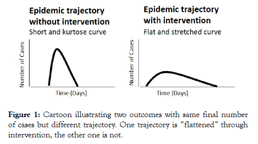
According to the World Health Organization (WHO), Corona virus disease 2019 (COVID19) reached the pandemic phase on March 11, 2020. As of April 29, 2020, it had spread to more than 200 countries worldwide, leading to 2,954,222 registered infections and 202,597 deaths. Particularly alarming characteristics of COVID-19 are its very high spreading rate with Reproduction Number higher than influenza [1], and severe illness trajectory observed in some patients requiring lengthy hospitalization and high-intensity care [2]. Hence, governments around the world considered, and to some extent, implemented a range in measures aimed at limiting people movements and interactions to attempt slowing down transmission of the COVID19 and to dampen the severity of the epidemic trajectory. This concept, popularly known as “flatten the curve” is illustrated in the schematic of Figure 1 by comparing two idealized epidemic trajectories: one with interventions and one without interventions. Data from the epidemic in Wuhan, China, indeed suggests the Reproduction number dropped after authorities imposed a lockdown [3,4]. However, studies on the impact of government measures on the epidemic outcome in other countries are at this stage still conceptual and in need of further calibration [5,6].
Figure 1: Cartoon illustrating two outcomes with same final number of cases but different trajectory. One trajectory is “flattened” through intervention, the other one is not.
Nearly two months into the pandemic, key objective of this paper is to present a data-driven evaluation of how different or similar COVID-19 epidemic trajectories of different regions or countries appear to be in terms of relative trajectory steepness and anticipated Epidemic Duration, in other words “flatness of the curve”. We have used available open-domain COVID-19 data and fitted these with an analytical model. We then used this model to forecast the complete epidemic trajectories for a sizeable number of countries and then compared those percountry epidemic trajectories, specifically with the following questions:
Are there any countries that appear to have "flattened" the curve much better than others?
Is there any relationship between the timing and rigor of government action and “flatness” of the epidemic trajectory? Our analysis and findings are summarized in the following paragraphs.
Methods
COVID-19 data source and analysis method
We made use of open-domain data on COVID-19 reported Cases and Deaths per country per day as published by the European Centre for Disease Prevention and Control (ECDC [7]). In our analysis we have assumed that reporting of Cases and Deaths per country are done in a consistent manner following WHO concepts and guidelines. Records available from this database up to 27/04/2020 were used.
We selected some 47 countries to perform our analysis on. These are mostly larger countries with relatively complete data. Population counts (used to normalize epidemic size) were obtained from various open sources like Wikipedia. Recognizing China’s vast size but lacking a detailed per-province breakdown of China’s COVID-19 case reporting, we have assumed that 83.6% of Cases and Deaths to date were from Hubei province (as per official reports; [8]) and used this assumption to construct separate “Hubei province” epidemic curves for use in our analysis.
For our analysis we chose to fit the reported number of Cases (per day and cumulative) and number of Deaths (per day and cumulative) with an analytical model following Gompertz equation. Gompertz equation was first proposed as early as the 19th century [9] as an animal population growth model to describe the extinction law of the population. Since then, it has been widely used to describe the spread law of infectious diseases like SARS and more recently, COVID-19 [10].
We rewrote Gompertz equation in a form where the number of Cases and the number of Deaths are considered interrelated as this maximizes the amount of data available for curve fitting and minimization of the regression residuals and hence improves the rigor of the fit. The equations used are as follows:
#Cases (t) = a*exp(-b*exp(-c*(t - t0))
#Deaths (t) = a*m*exp(-b*exp(-c*((t-d) - t0))
Where:
a: the final number of Cases at the end of the epidemic
b and c: fitting constants
t0: time of initiation of the epidemic wave
d: “Mortality Delay”, this entity represents the average time lapse between a person reported a COVID-19 Case and that person reported as a COVID-19 Death
m: the intrinsic or Final Mortality Rate of the epidemic
Curve fitting is done with Microsoft EXCEL™ using its numeric solver to iteratively adjust all available curve-fitting parameters (t0, a, b, c, d and m) until residuals of both the cumulative Cases and cumulative Death counts are minimized. Because we are interested in the epidemic trajectory curve-shape and specifically the height of the Epidemic Peak (maximum number of Cases reported per day) and the expected Epidemic Duration, we considered that quality fit to the mid and later part of the curves is more critical than the very early part. Therefore, in the computation of regression residuals, we chose to omit the very early part of the curve where the cumulative number of Cases is less than 1 per million population and the daily number of new Cases per 10 million population is also less than 1. We found that this enhanced the overall fit quality and stability.
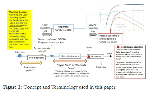
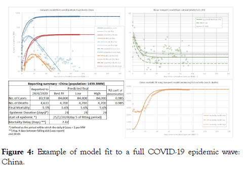
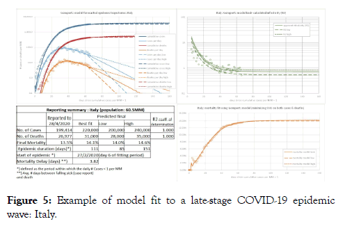
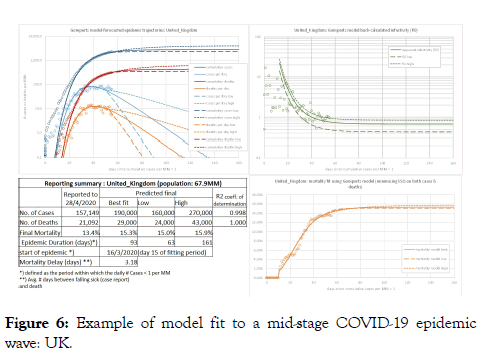
The model and some of the key terminology used in this paper are further illustrated in Figure 2. Typical output plots from a per country model fit are shown in Figures 3-6. Note that we back-calculate two additional measures from the model outputs to provide additional visualization of the model quality-of-fit namely: apparent Mortality Rate (cumulative Deaths over cumulative Cases throughout the epidemic) and the apparent reproduction or infectivity number (R0), again throughout the epidemic. For computation of R0 we assume an incubation period of five (5) days as what was observed during the Wuhan epidemic outbreak [11]. Solid lines on the graphs depict the best model fit (minimized residuals), we consider this the Best-fit or Mid outcome. Dotted and dashed lines respectively depict the High and Low outcomes, definition of which is described in the next paragraph.
Figure 2: Concept and Terminology used in this paper.
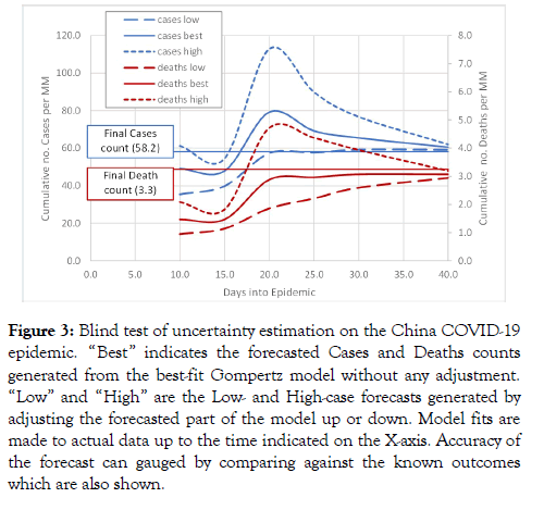
Figure 3: Blind test of uncertainty estimation on the China COVID-19 epidemic. “Best” indicates the forecasted Cases and Deaths counts generated from the best-fit Gompertz model without any adjustment. “Low” and “High” are the Low- and High-case forecasts generated by adjusting the forecasted part of the model up or down. Model fits are made to actual data up to the time indicated on the X-axis. Accuracy of the forecast can gauged by comparing against the known outcomes which are also shown.
Figure 4: Example of model fit to a full COVID-19 epidemic wave: China.
Figure 5: Example of model fit to a late-stage COVID-19 epidemic wave: Italy.
Figure 6: Example of model fit to a mid-stage COVID-19 epidemic wave: UK.
Uncertainty quantification method
We believe it is critical to express uncertainty pertaining to our forecasts and this uncertainty estimate should somehow reflect the observed imperfection of our model fit.
To quantify uncertainty pertaining to the model fit and to estimate a range in forecasted final number of Cases and Epidemic Duration, we have made use of the model-implied Reproduction Number or Infectivity (R0), back-calculated from our model outputs. We computed residuals between the model R0 and the apparent R0 computed from the COVID-19 data and computed the residuals Standard-Deviation. To then make a Low estimate of the number of Cases, we adjusted the forecast portion of the model Cases-curve (beyond the last measured data) to reflect a Low estimate of R0 (one Standard Deviation down from the model best-fit R0). Similarly, a High forecast for the number of Cases was generated using a High estimate of R0 (half a Standard Deviation up from the model best-fit R0). Reason to use an asymmetric error band around the R0 (half a Standard Deviation upwards, one Standard Deviation downwards) in the creation of Low and High curves is because Gompertz model predictions tend to be somewhat pessimistic (too high rather than too low) [10]. Also, for some countries we observed that if we defined a high-case estimate of R0 as one (1) Standard Deviation up from the best fit R0, that high-case R0 would never decline below one (which means, the epidemic would never end).
To generate Low and High estimates for the number of Deaths we computed Low and High estimates of COVID-19 Mortality Rate. This was done using the fitting residuals between the Mortality-Rate trajectory from the model and apparent Mortality Rate computed from the COVID-19 data. Low and High estimates of Mortality Rate represent adjustments of two (2) Standard Deviations down and up respectively, relative to the model best-fit Mortality trajectory. Again, Low and High adjustments to the number of Deaths are made to the forecast portion of the output curves only.
To test the validity and robustness of this approach to quantify uncertainty on the epidemic forecasts, we applied our method in a “blind test” to the actual China COVID-19 epidemic data. That is, we performed a series of trials where for each trial we removed the data post a chosen point in time, fitted the model to the remaining data and then compared the model forecasts with the omitted data. We did this starting from epidemic Peak (day 10 of the epidemic) onward to epidemic end. The plot of Figure 3 shows results from this trial. It illustrates how Low-, Mid- and High-case predictions of the final counts of Cases and Deaths evolve as a function of time since epidemic start and how these compare to the known outcomes. From about day 16 onward (6 days after epidemic Peak), the known outcomes fall within the model prediction band and from about day 22 on the forecasts rapidly converge towards the known outcome. Supported by this positive finding, we then applied our methodology of calculating Low- and High-case curves for the number of Cases and Deaths to epidemic forecasts for the other countries.
Linking analysis findings to government action
We have attempted to relate specifics of the epidemic trajectories of different countries to the mitigation approach taken by governments of those countries. For this part of the analysis, we made use of the COVID-19 Government Response Stringency Index concept developed and published by Oxford University and Blavatnik School [12]. These workers collect publicly available information on 18 indicators of government response (C1-C8, E1-E4, H1-H5 and M1), and store this in a publicly downloadable database [12]. Thirteen of the indicators (C1-C8, E1-E2, H1-H3) take policies such as school closures, travel bans, etc, and are recorded on an ordinal scale; the others (E3, E4, H4, H5 and M1) are financial indicators such as fiscal or monetary measures. Scores on items C1-C8 and H1 which are specifically aimed at suppressing the spread of the virus, are then rolled into one “Stringency Index” score: a number between 0 and 100, and recorded in the database [12]. The higher the number, the more rigorous the government preparedness and measures are. Stringency Index scores are recorded over time and as governments implemented more measures, scores went up. We downloaded the data as of 28/04/2020 and coupled the Stringency Index scores with our epidemic trajectory fitting results such that we could extract the “Stringency Score” at key dates in the trajectory such as epidemic onset, Epidemic Peak etc. Besides the “Stringency Score”, we have used the average of scores on H2 (testing policy) and H3 (contact tracing) as recorded in the database [12] to also compute a “Testing and Contact Tracing Stringency score” (again a number between 0 and 100) for use in our analysis.
Results
Summary of curve fitting results
Results of curve-fitting and model forecasting for all the 47 countries plus Hubei Province (China) are summarized in Table 1. Note that besides estimates of the final Cases and Deaths count for various countries, we have also used our model fits to estimate Epidemic Duration. Note that to allow for a fair comparison of epidemic trajectories of different countries, our definition of start and end of the epidemic is on the basis of cases per million population. Specifically, we define the epidemic period as the period where the daily reported number of cases is in excess of 1 per million population.
Table 1: Key Epidemic Parameters per Country extracted from our Model.
| Country | Population (MM) | Start epidemic | Days to Epidemic Peak | Epidemic Peak (max. no. cases/day/MM) | Forecasted Epidemic Duration (days) | Final number of Cases / MM population | Final number of Deaths / MM | Forecasted final Mortality Rate | Model Mortality Delay (days) | |||||||||
|---|---|---|---|---|---|---|---|---|---|---|---|---|---|---|---|---|---|---|
| Low estimate of Duration | Best estimate of Duration | High | High/Low Duration ratio | Low estimate of Cases | Best estimate of Cases | High estimate of Cases | High/Low Cases ratio | Low estimate of Deaths | Best estimate of Deaths | High estimate of Deaths | High/Low Deaths ratio | |||||||
| Argentina | 45.2 | 23/3/2020 | 15 | 2.7 | 35 | 39 | 44 | 1.26 | 86.3 | 94.8 | 108.4 | 1.26 | 4.9 | 5.8 | 6.9 | 1.41 | 6.10% | 7 |
| Australia | 25.5 | 11/3/2020 | 14 | 11.1 | 44 | 46 | 50 | 1.14 | 274.5 | 279.3 | 298 | 1.09 | 3.3 | 3.5 | 3.8 | 1.15 | 1.30% | 10.3 |
| Austria | 9 | 7/3/2020 | 19 | 67.6 | 57 | 69 | 103 | 1.81 | 1776.5 | 1783.7 | 1887.5 | 1.06 | 62.2 | 64.9 | 71.1 | 1.14 | 3.60% | 11.3 |
| Belgium | 11.6 | 9/3/2020 | 30 | 128.9 | 73 | 113 | 169 | 2.32 | 4141.6 | 5026.2 | 8542.1 | 2.06 | 802.4 | 991.3 | 1725.7 | 2.15 | 19.70% | 8.3 |
| Brazil | 212.6 | 24/3/2020 | 33 | 12.9 | 60 | 103 | 166 | 2.77 | 390.5 | 703.9 | 1731.3 | 4.43 | 36.2 | 69 | 174.1 | 4.81 | 9.80% | 5.9 |
| Canada | 37.7 | 17/3/2020 | 26 | 44.6 | 62 | 89 | 146 | 2.35 | 1298.3 | 1606.7 | 2278.6 | 1.76 | 100.7 | 127.9 | 190.8 | 1.89 | 8.00% | 10.2 |
| Chile | 19.1 | 19/3/2020 | 20 | 25.4 | 51 | 66 | 88 | 1.73 | 680.1 | 747.5 | 889.3 | 1.31 | 11.5 | 13.5 | 16.2 | 1.41 | 1.80% | 7.5 |
| China | 1,439.30 | 28/1/2020 | 10 | 2.7 | 21 | 24 | 21 | 1 | 58.4 | 58.2 | 58.4 | 1 | 3.3 | 3.3 | 3.3 | 1 | 5.60% | 7.4 |
| Croatia | 4.1 | 12/3/2020 | 19 | 17.8 | 54 | 62 | 78 | 1.44 | 511.5 | 543.1 | 609 | 1.19 | 15.8 | 18.5 | 20 | 1.26 | 3.40% | 12.7 |
| Czechia | 10.7 | 12/3/2020 | 18 | 25.8 | 52 | 62 | 80 | 1.54 | 691 | 721.7 | 793.7 | 1.15 | 23.3 | 25.2 | 27.1 | 1.16 | 3.50% | 10.4 |
| Denmark | 5.8 | 9/3/2020 | 24 | 47.8 | 59 | 83 | 166 | 2.81 | 1415.7 | 1586.7 | 2555.2 | 1.8 | 77.7 | 88.3 | 146.7 | 1.89 | 5.60% | 5.6 |
| Egypt | 102.3 | 3/4/2020 | 13 | 1.5 | 23 | 34 | 65 | 2.83 | 45 | 75 | 135.8 | 3.02 | 3.3 | 6 | 13.7 | 4.12 | 8.00% | 1.8 |
| Finland | 5.5 | 11/3/2020 | 27 | 25.6 | 62 | 91 | 164 | 2.65 | 866.3 | 1083.2 | 2093.6 | 2.42 | 50.5 | 67.9 | 131.8 | 2.61 | 6.30% | 15 |
| France | 65.3 | 9/3/2020 | 23 | 66.7 | 62 | 84 | 151 | 2.44 | 1991.6 | 2113.3 | 2604.4 | 1.31 | 398.3 | 440.3 | 566.8 | 1.42 | 20.80% | 7.8 |
| Germany | 83.8 | 9/3/2020 | 22 | 65.2 | 60 | 81 | 156 | 2.6 | 1909.7 | 2014.9 | 2506.4 | 1.31 | 77.6 | 85 | 108.6 | 1.4 | 4.20% | 11.2 |
| Greece | 10.4 | 11/3/2020 | 16 | 8.7 | 46 | 49 | 64 | 1.39 | 230.3 | 244.3 | 297.4 | 1.29 | 12.5 | 13.3 | 15.4 | 1.23 | 5.40% | 5.8 |
| Hungary | 9.7 | 21/3/2020 | 21 | 9.8 | 45 | 61 | 104 | 2.31 | 279.5 | 334.4 | 507.2 | 1.81 | 37.3 | 45.8 | 71.4 | 1.92 | 13.70% | 7.1 |
| Iceland | 0.3 | 14/3/2020 | 13 | 290.1 | 50 | 53 | 176 | 3.52 | 5274.8 | 5279.1 | 5567.9 | 1.06 | 32.2 | 34.5 | 35.2 | 1.09 | 0.70% | 11.7 |
| India | 1,380.00 | 13/4/2020 | 1 | 0.9 | <5 days | - | 22.5 | 20.3 | 29.7 | 1.32 | 0.7 | 0.8 | 1.1 | 1.5 | 3.80% | 1 | ||
| Indonesia | 273.5 | 10/4/2020 | 5 | 1 | 9 | 9 | 9 | 1 | 36.6 | 49.2 | 69.5 | 1.9 | 3.5 | 4.9 | 7.7 | 2.21 | 10.00% | 2.8 |
| Iran | 84 | 25/2/2020 | 35 | 26.2 | 80 | 118 | 172 | 2.15 | 1143 | 1387.4 | 2488.3 | 2.18 | 71.4 | 90 | 202.4 | 2.83 | 6.50% | 1 |
| Ireland | 4.9 | 14/3/2020 | 30 | 142.2 | 78 | 117 | 165 | 2.12 | 4455.4 | 5704 | 8708.4 | 1.95 | 344.3 | 490 | 810.1 | 2.35 | 8.60% | 10.8 |
| Israel | 8.7 | 9/3/2020 | 28 | 58.7 | 63 | 97 | 142 | 2.25 | 1848.5 | 2217.7 | 2657.3 | 1.44 | 28.9 | 35.9 | 45.1 | 1.56 | 1.60% | 9.2 |
| Italy | 60.5 | 27/2/2020 | 30 | 90 | 85 | 111 | 151 | 1.78 | 3307.9 | 3619.4 | 3969.4 | 1.2 | 463.1 | 512.3 | 578.9 | 1.25 | 14.20% | 3.8 |
| Japan | 126.5 | 25/3/2020 | 25 | 3.9 | 39 | 68 | 117 | 3 | 118.6 | 205.2 | 347.9 | 2.93 | 5.4 | 12.6 | 27.7 | 5.15 | 6.10% | 15 |
| Malaysia | 32.4 | 12/3/2020 | 16 | 6.2 | 44 | 47 | 53 | 1.2 | 176.1 | 185.3 | 207 | 1.18 | 3 | 3.3 | 3.7 | 1.22 | 1.80% | 3.7 |
| Mexico | 128.9 | 31/3/2020 | 22 | 5.1 | 44 | 64 | 94 | 2.14 | 147.4 | 223.5 | 349 | 2.37 | 21.7 | 34.2 | 55.8 | 2.57 | 15.30% | 7.1 |
| Morocco | 36.9 | 26/3/2020 | 25 | 4.1 | 43 | 69 | 162 | 3.77 | 132.8 | 212.8 | 514.8 | 3.88 | 15.7 | 32.3 | 94.8 | 6.03 | 15.20% | 15 |
| Netherlands | 17.1 | 10/3/2020 | 25 | 72.5 | 66 | 91 | 153 | 2.32 | 2217.7 | 2458.4 | 3151.5 | 1.42 | 280.1 | 317 | 414.4 | 1.48 | 12.90% | 4.2 |
| New_Zealand | 4.8 | 15/3/2020 | 14 | 10.2 | 44 | 47 | 50 | 1.14 | 269.6 | 269.9 | 290.3 | 1.08 | 3.7 | 4.9 | 5.2 | 1.39 | 1.80% | 15 |
| Norway | 5.4 | 6/3/2020 | 20 | 51.1 | 58 | 70 | 101 | 1.74 | 1365 | 1403.6 | 1531 | 1.12 | 38.7 | 40.8 | 44.3 | 1.14 | 2.90% | 14.8 |
| Pakistan | 220.9 | 1/4/2020 | 15 | 2.2 | 29 | 38 | 57 | 1.97 | 67.9 | 87.6 | 131.3 | 1.93 | 1.9 | 2.7 | 4.2 | 2.27 | 3.00% | 6.4 |
| Philippines | 109.6 | 24/3/2020 | 13 | 2.3 | 31 | 35 | 54 | 1.74 | 69.4 | 81 | 132.3 | 1.91 | 4.7 | 6.1 | 12.8 | 2.69 | 7.50% | 4.4 |
| Poland | 37.8 | 20/3/2020 | 19 | 11.2 | 46 | 58 | 77 | 1.67 | 317.1 | 347.5 | 422.8 | 1.33 | 16.4 | 19.2 | 23.3 | 1.42 | 5.50% | 6.9 |
| Portugal | 10.2 | 11/3/2020 | 25 | 80 | 63 | 90 | 167 | 2.65 | 2353.7 | 2644.3 | 3824.8 | 1.63 | 95.1 | 110.6 | 166.7 | 1.75 | 4.20% | 5.7 |
| Romania | 19.2 | 16/3/2020 | 26 | 19.4 | 58 | 82 | 139 | 2.4 | 623.8 | 752.9 | 1143.6 | 1.83 | 36.4 | 47.2 | 72.8 | 2 | 6.30% | 4.7 |
| Russia | 145.9 | 1/4/2020 | 22 | 33.2 | 48 | 76 | 137 | 2.85 | 671.5 | 1091.5 | 2158.5 | 3.21 | 6.8 | 12.5 | 28.8 | 4.24 | 1.10% | 2.7 |
| Singapore | 5.9 | 28/3/2020 | 28 | 145.5 | 57 | 107 | 154 | 2.7 | 2734.9 | 5300.1 | 8888.4 | 3.25 | 23.9 | 53 | 92.3 | 3.86 | 1.00% | 15 |
| Slovenia | 2.1 | 6/3/2020 | 19 | 23.6 | 55 | 63 | 78 | 1.42 | 673.4 | 689.8 | 817.7 | 1.21 | 43.8 | 47.7 | 52.9 | 1.21 | 6.90% | 13.9 |
| South_Korea | 51.3 | 20/2/2020 | 13 | 9.1 | 40 | 40 | 40 | 1 | 214.6 | 209.7 | 214.6 | 1 | 4.7 | 4.8 | 4.7 | 1 | 2.30% | 15 |
| Spain | 46.8 | 7/3/2020 | 24 | 157.8 | 68 | 92 | 146 | 2.15 | 4491.5 | 4817.7 | 5560.9 | 1.24 | 491.9 | 540.1 | 620.3 | 1.26 | 11.20% | 2.9 |
| Sweden | 10.1 | 12/3/2020 | 27 | 57.6 | 65 | 100 | 162 | 2.49 | 1782.3 | 2242.6 | 4356.8 | 2.44 | 297.1 | 373.9 | 722.8 | 2.43 | 16.70% | 9.5 |
| Switzerland | 8.7 | 6/3/2020 | 22 | 126.1 | 64 | 81 | 118 | 1.84 | 3350.8 | 3504.4 | 3813 | 1.14 | 161.8 | 167.2 | 184.9 | 1.14 | 4.80% | 9.3 |
| Turkey | 84.3 | 20/3/2020 | 23 | 53.4 | 63 | 81 | 103 | 1.63 | 1422.8 | 1704.6 | 2015.7 | 1.42 | 36.8 | 46.4 | 59.3 | 1.61 | 2.70% | 2.8 |
| Ukraine | 43.7 | 30/3/2020 | 16 | 9 | 34 | 46 | 78 | 2.29 | 194.4 | 241.8 | 375 | 1.93 | 5.3 | 6.7 | 11.4 | 2.17 | 2.80% | 1 |
| United_Kingdom | 67.9 | 16/3/2020 | 26 | 82.1 | 63 | 93 | 161 | 2.56 | 2356.9 | 2797.4 | 3977.3 | 1.69 | 353.5 | 428.3 | 633.4 | 1.79 | 15.30% | 3.2 |
| USA | 331 | 14/3/2020 | 27 | 103.1 | 71 | 99 | 149 | 2.1 | 3081.5 | 3622.8 | 4622.3 | 1.5 | 202.4 | 258.9 | 362.5 | 1.79 | 7.10% | 7.1 |
| Hubei | 60.3 | 20/1/2020 | 18 | 48.8 | 60 | 60 | 60 | 1 | 1161.2 | 1162 | 1161.2 | 1 | 64.7 | 64.3 | 64.7 | 1 | 5.50% | 6.4 |
To illustrate the quality of the fit and the shape of the observed and forecasted parts of epidemic trajectories, we have selected three countries, each of which are in a different phase of the epidemic. China (Figure 4) has experienced one complete COVID-19 epidemic “wave”. It can be seen that at the epidemic onset, rise in number of Cases is very quick whilst the decline in number of Cases in the tail end is more gradational. A similar shape of epidemic trajectory is seen in the case of Italy (Figure 5) which is in the late stage of the epidemic as the number of Cases is clearly declining. In comparison, the United Kingdom (Figure 6) is relatively at the early stage of the epidemic. The Italy and UK examples also show the Low and High forecasts of the Cases and Deaths count besides the best fit curves. Due to less mature stage of the epidemic but also due to the actual COVID-19 data having some scatter around the model curves of R0 and Mortality Rate, uncertainty margins around the forecasted Cases and Deaths counts for UK are wider than for Italy.
We generally observe that the coefficient of determination or R2 of the model fit is very high for virtually all countries. R2 values for the Cases and Death curves are mostly in excess of 0.98 with the R2 for the Cases curve generally slightly higher than the Deaths curve. Whilst the quality of fit appears acceptable certainly from a point of view of analysing differences in epidemic trajectories, high R2 values suggesting a near-perfect fit can be somewhat misleading. The Mortality Rate and Infectivity trajectories that we back-calculate from our model and then plot against the actual data (as shown in the examples of Figures 4-6) , provide ready visualization of issues with the data and may provide a better judgement of the quality of fit of the model than the R2 alone.
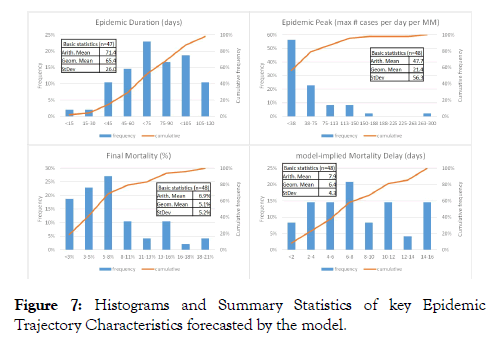
Basic statistics and histograms of the key epidemic trajectory parameters extracted from the model fit of all 47 countries plus Hubei province are shown in Figure 7. Epidemic Duration shows a slight left-skewed distribution (suggesting that shortduration epidemics are less frequent than long-duration epidemics) with a mean of 71 days. Epidemic Peak (maximum number of cases per day per MM) shows a lognormal distribution where most of the epidemics are relatively modest (a peak of less than 40 cases per day per MM) but with a long “tail” of more severe epidemic spikes (up to 300 cases per day per MM). Average Final Mortality Rate is around 7% but the distribution is skewed to the right i.e., relatively low Mortality Rate (<5%) is more common whilst high Mortality Rate (>11%) is more rare. Distribution of the model-implied Mortality Delay is more or less symmetric with a mean of around 8 days.
Figure 7: Histograms and Summary Statistics of key Epidemic Trajectory Characteristics forecasted by the model.
Uncertainty on the forecasts
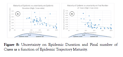
Our findings on uncertainty pertaining to the model forecasts are summarized in Figures 8. Figure 8a plots the ratio of the High over Low estimate of Epidemic Duration against Epidemic Maturity. Epidemic Maturity is defined as the number of days into the epidemic (from start until end of available data) over the best estimate of total Epidemic Duration. The plot suggests that in the early stages of an epidemic, around Epidemic Peak, uncertainty pertaining to the estimated Epidemic Duration is typically a factor of 2 or more. This uncertainty reduces as the epidemic matures but even in the mature part of the epidemic trajectory, estimates of final Epidemic Duration still carry some uncertainty. Figure 8b shows a similar plot of Epidemic Maturity versus the High over Low estimate of the Final Number of Cases. Around the Epidemic Peak, uncertainty on the Final number of Cases is typically around a factor of 2 but the uncertainty reduces rather quickly as the epidemic progresses. In the mature stages of an epidemic, estimates of Final number of Cases become more tightly constrained.
Figure 8: Uncertainty on Epidemic Duration and Final number of Cases as a function of Epidemic Trajectory Maturity.
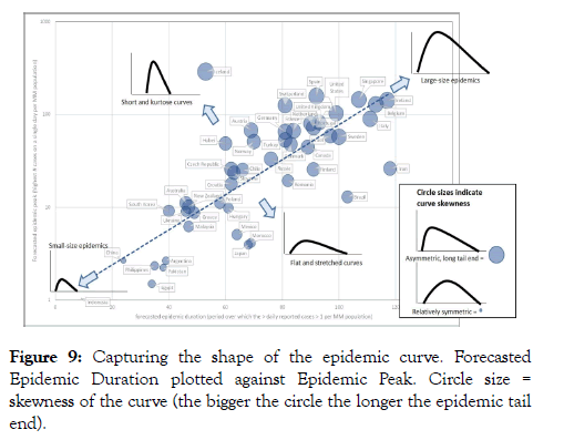
Analysis of epidemic curve shapes and trajectories To highlight differences in the epidemic trajectory shape of the different countries, in Figure 9 we have plotted forecasted Epidemic Duration versus Epidemic Peak (normalised per MM population). In Figure 9, size of the symbols depicts epidemic trajectory skewness (defined as the Epidemic Tail duration minus Epidemic Onset duration, over total Epidemic Duration). It can be seen that most trajectories plot around the same line of Epidemic Duration vs population-normalized Epidemic Peak. This suggests that many of the trajectories are similar in shape. Since in this plot, Epidemic Peak is plotted on a logarithmic scale whilst Epidemic Duration is on a linear scale, it implies that the height of the Epidemic Peak increases exponentially as Epidemic Duration increases. Obviously, countries that plot on the top right end of the line have a much more severe epidemic (with a high Peak and a long Duration) compared to countries in the bottom left. Another observation is that generally, the longer the epidemic the more asymmetric the curve (positive or to-the-right skew with a long tail end; these are the big circles on the plot of Figure 9).
Figure 9: Capturing the shape of the epidemic curve. Forecasted Epidemic Duration plotted against Epidemic Peak. Circle size = skewness of the curve (the bigger the circle the longer the epidemic tail end).
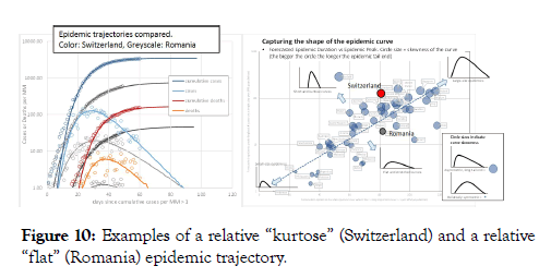
Countries that plot above the best-fit line have a more kurtose or “spiked” epidemic trajectory, that is, the Epidemic Peak is relatively high. In contrast, countries plotting below the best-fit line have a relatively flat epidemic trajectory with a suppressed Epidemic Peak. To illustrate this difference, in Figure 10 we compare two countries with near-identical epidemic duration: Switzerland and Romania. The trajectory of Romania is evidently flatter than that of Switzerland. Besides Romania, other countries that record a significant number of COVID-19 cases but appear to have a relatively flat epidemic trajectory are Finland, Brazil and Iran (Figure 9).
Figure 10: Examples of a relative “kurtose” (Switzerland) and a relative “flat” (Romania) epidemic trajectory.
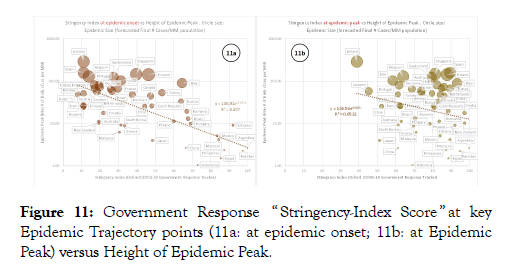
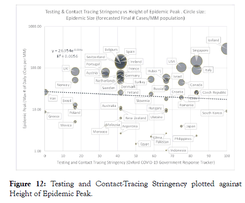
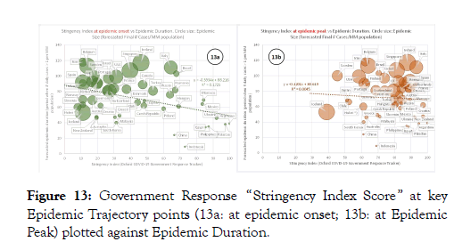
To investigate whether a relationship might exist between the epidemic trajectory shapes of countries and government measures aimed at suppressing the epidemic, we then crossplotted normalized Epidemic Peak against the COVID-19 Government Response Stringency Index score. Figure 11a shows Government Response Stringency at the time of onset of the epidemic against Epidemic Peak height for each country. There is a clear trend (R2=0.50) of decreasing Epidemic Peak height with increased Government Stringency. Figure 11b plots Government Response Stringency at the time of Epidemic Peak against Epidemic Peak height. The trend is much weaker now and the correlation coefficient is insignificant (R2=0.05). We also attempted to cross-plot Epidemic Peak height per country versus the Government Testing and Contact Tracing stringency but we see no relationship whatsoever (Figure 12; R2=0.006). We then cross-plotted Epidemic Duration versus COVID-19 Government Response Stringency Index score (Figure 13). Similar to the observations on Epidemic Peak height, we also see a relationship between Epidemic Duration and Government Stringency at the time of epidemic onset albeit with slightly more scatter and lower correlation strength (R2=0.17; Figure 13a).
Figure 11: Government Response “ Stringency-Index Score ” at key Epidemic Trajectory points (11a: at epidemic onset; 11b: at Epidemic Peak) versus Height of Epidemic Peak.
Figure 12: Testing and Contact-Tracing Stringency plotted against Height of Epidemic Peak.
Figure 13: Government Response “Stringency Index Score ” at key Epidemic Trajectory points (13a: at epidemic onset; 13b: at Epidemic Peak) plotted against Epidemic Duration.
Analysis of final mortality rate
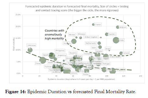
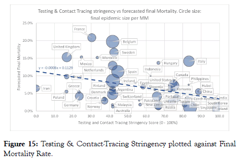
Figure 14 shows a cross-plot of Epidemic Duration versus forecasted Final Mortality Rate for different countries. The majority of the countries analysed have a mortality of less than 8% and it appears there is a slight trend of decreasing Mortality Rate with increasing Epidemic Duration. A number of countries (highlighted in Figure 14) plot anomalously far above this trend. We also plotted Final Mortality Rate versus Government Testing and Contact Tracing stringency (Figure 15). Here, we see a clear trend of decreasing Final Mortality Rate with increased Testing and Contact Tracing stringency. Most of the countries that plotted off the trend in Figure 14 (Belgium, France, Mexico, Morocco, Netherlands, Sweden, UK) appear to have a relatively low testing and contact tracing rigor.
Figure 14: Epidemic Duration vs forecasted Final Mortality Rate.
Figure 15: Testing & Contact-Tracing Stringency plotted against Final Mortality Rate.
Discussion
We observe that the modelled epidemic curves of various countries generally look remarkably similar and mimic the observed trajectory shape of the epidemic in China. That is, the increase in the number of Cases from time of epidemic onset to Epidemic Peak is steeper than the subsequent decline. The Gompertz model allows for a good quality of fit to the data and can capture this asymmetry adequately. Our approach to estimating uncertainty which we validated via a blind test to China data suggests that the model prognoses included the estimated uncertainty bands become robust shortly after the time of Epidemic Peak.
The observed relationship between recorded Government Stringency at the time of epidemic onset and the height of the Epidemic Peak (and to a less extent, Epidemic Duration), is significant and impactful. It suggests that government measures taken very early in the epidemic have the potential to significantly suppress the Epidemic Peak (reduce the maximum number of cases per day by a factor of 10 or more) and also shorten the Epidemic Duration. On the other hand, measures taken later on in the epidemic (around Epidemic Peak time or later) appear to not impact the epidemic trajectory significantly any more. This hypothesis appears one plausible explanation for the differences in epidemic trajectories between Switzerland and Romania, the example we highlighted earlier. The Romanian epidemic trajectory is significantly flatter than that of Switzerland (Figure 10). At the time of epidemic onset Switzerland had a Stringency-Index Score of 27 whilst Romania has a score of 67 (on a scale of 0 to 100). In other words, Government Stringency Index scores suggest Romania was better prepared to suppress the epidemic in its early stage than Switzerland. At the time of Epidemic Peak, governments of both countries had tightened up measures as Switzerland had a Stringency-Index Score of 79 compared to Romania’s score of 88. However by that time, the epidemic had already spread much wider in Switzerland compared to Romania.
Also potentially significant is the lack of any observed relationship between Epidemic Peak height of various countries and the Government Stringency Score on Testing and Contact Tracing. This suggests that Testing and Contact Tracing alone might not be sufficiently effecting in combating the spread of the virus and suppressing the epidemic.
With regards to Mortality Rate, the clear trend of reduced forecasted Final Mortality Rate with increased Government Testing and Contact-Tracing Stringency suggest that rigor and extent of testing in individual countries has a significant imprint on the reported number of Cases and hence, Mortality Rate. We speculate that countries like France, Belgium and Sweden could might have reported a similar Mortality Rate as Italy if they would have adopted a similar rigor in testing and contact tracing. Similarly, Netherlands and Spain might report a Mortality Rate more similar to United States, Canada or China if they would test more. Our cross-plots suggest that on average, a country that does very little testing (stringency score of 0) might report a Mortality Rate of around 11%. With a very rigid testing strategy (stringency score of 100), our data suggests average Mortality Rate drops to around 4.5% essentially because many more illness cases are detected.
Conclusions
Conclusions from our work fall into three categories as summarized below.
• High to very high R (Coefficient of determination) and an acceptable visible fit quality for most countries;
• Graphs of back-calculated Mortality-Ratio and Infectivity (R0) trajectories provide additional and potentially better visualization of the fit quality than the R.
• The spread of apparent R0 (Reproduction Number or Infectivity) around the back-calculated model infectivity can be used to compute uncertainty bands around the model forecasts. Blind tests against actual data show this approach is reasonable.
Shape of the epidemic trajectories of various countries. We find that:
• The epidemic curves of various countries overall look similar and mimic the observed trajectory shape of the epidemic in China. That is, the increase in the number of Cases from time of epidemic onset to Epidemic Peak is steeper than the subsequent decline;
• Most trajectories plot around the same line of Epidemic Duration vs normalized Epidemic Peak height. Generally, the longer the epidemic the more asymmetric the curve (positive or to-the-right skew, with a long tail end);
Some countries do have flatter and less severe trajectories than others.
• Relationships between epidemic trajectory shape and government action during the epidemic (quantified using COVID-19 Government Response Tracker). We noted that:
• There is a clear relationship between Epidemic Peak height (maximum number of cases per day) and the rigor of government measures at the time of epidemic onset. In contrast, there is little relationship between Epidemic Peak height and government approach later on during the epidemic;
• Similar but weaker relationship can be observed between government stringency at the time of epidemic onset and forecasted Epidemic Duration.
• Finally, we see a trend of reduced forecasted Final Mortality Rate with increased Government Testing and Contact-Tracing Stringency. This suggests that rigor and extent of testing in individual countries has a significant imprint on the reported number of Cases and hence, reported Mortality Rate.
Observations under 3) suggests that as far as impacting duration and severity of a COVID-19 epidemic, timing of government measures is critical. Actions taken in the very early stages of an epidemic have the potential to significantly suppress the Epidemic Peak and may also shorten Epidemic Duration. Whereas actions taken later in the epidemic are likely have limited impact on the expected epidemic trajectory.
Competing Interests
The authors declare there is no financial or commercial relationships or any competing interests.
Funding
This study did not utilize any external funding.
Availability of Data and Materials
All datasets used for supporting the conclusions of this article are publically available from public data repositories as specified in the Methods section. Software used for curve fitting is Microsoft EXCEL™.
Author Contributors
AJWE provided the statistical analysis and much of the research and analysis .SN, DN & DMN performed the data collection and research in equal contributions.
Acknowledgements
The authors would like to thank Dr Malinee Thambyayah from Pantai Hospital Kuala Lumpur for her helpful comments and expert advice.
REFERENCES
- Coburn BJ, Wagner BG, Blower S. Modeling influenza epidemics and pandemics: insights into the future of swine flu (H1N1). BMC Medicine. 2009;7(1):30.
- Verity R, Okell LC, Dorigatti I, Winskill P, Whittaker C, Imai N, et al. Estimates of the severity of coronavirus disease 2019: a model-based analysis. Lancet Infect Dis. 2020.
- Li J, Wang Y, Gilmour S, Wang M, Yoneoka D, Wang Y, et al. Estimation of the epidemic properties of the 2019 novel coronavirus: A mathematical modeling study. medRxiv. 2020.
- Anastassopoulou C, Russo L, Tsakris A, Siettos C. Data-based analysis, modelling and forecasting of the COVID-19 outbreak. PLoS ONE. 2020;15(3):e0230405.
- van Wees JD, Osinga S, van der Kuip M, Tanck M, Hanegraaf M, Pluymaekers M, et al. Forecasting hospitalization and ICU rates of the COVID-19 outbreak: an efficient SEIR model. [Submitted]. Bull World Health Organ. 2020.
- Qasim M, Ahmad W, Yoshida M, Gould M, Yasir M. Analysis of the Worldwide Corona Virus (COVID-19) Pandemic Trend; A Modelling Study to Predict Its Spread. medRxiv. 2020.
- European Centre for Disease Prevention and Control European - today’s data on the geographic distribution of COVID-19 cases worldwide.
- Statistica. Number of novel coronavirus COVID-19 infection, death and recovery cases in Greater China as of April 30, 2020, by region. 2020.
- Gompertz B. On the Nature of the Function Expressive of the Law of Human Mortality, and on a New Mode of Determining the Value of Life Contingencies. Philosophical Transactions of the Royal Society of London. 1825;115:513-583.
- Yang W, Zhang D, Peng L, Zhuge C, Hong L. Rational evaluation of various epidemic models based on the COVID-19 data of China. medRxiv. 2020.
- Lauer SA, Grantz KH, Bi Q, Jones FK, Zheng Q, Meredith HR, et al. The Incubation Period of Coronavirus Disease 2019 (COVID-19) From Publicly Reported Confirmed Cases: Estimation and Application. Ann Intern Med. 2020.
- Hale T, Angrist N, Kira B, Petherick A, Phillips T, Webster S. Variation in government responses to COVID-19. Working Paper, Version 5.0, 24. 2020.
Citation: Everts AJW, M Navaratnam D, Navaratnam S, Navaratnam D (2020) Analysing Covid-19 Epidemic Trajectories: are Countries Flattening the Curve? Biol Med (Aligarh) 12:465. doi: 10.35248/0974-8369.20.12.465.
Copyright: © 2020 Everts AJW, et al. This is an open-access article distributed under the terms of the Creative Commons Attribution License, which permits unrestricted use, distribution, and reproduction in any medium, provided the original author and source are credited.
